
Nature Calls
I caught a press release over the wire last week from the State of Colorado. An overly lengthy press release, I might add. The purpose of the release was to pimp a recently completed branding effort for the state.
Press releases are more art than science. Only a small fraction of them ever get picked up by the media. Using Colorado as an example, here are three rules to follow to increase the odds of getting your story out.
First, when I was a newsman, I liked releases that were simple and interesting. I always figured if it was interesting to me it might be interesting to my audience. So the first rule is to write the release well. Make it sound interesting. Every editor or reporting reading it will tell right away whether he’ll pick up the story or not. Binary choice. Takes about eleven seconds.
Second, keep it short. Don’t embellish. Let the story tell itself. The Colorado release is overwrought, overblown and, at over a thousand words, overgrown.
What do we learn in the release? That the branding effort (itself branded “Making Colorado”) is the “most inclusive,” “most collaborative” and most “ambitious branding effort ever undertaken by a state.”
Certainly not the most modest.
Third, if it’s not newsworthy, don’t bother releasing it. The fact is, not everything that happens in your organization is newsworthy. A newsroom isn’t a Middle Eastern bazaar. Don’t try to hawk all your wares there. Colorado came up with a new brand and a new logo. That’s nice. But not necessarily newsworthy. Happens every day. But the State claims it’s the first “unified” brand for Colorado. What does that mean and why should anyone care?
The release goes into agonizing detail about the bureaucratic effort that went into designing the new logo, the new brand, and apparently, the press release. After 12 months and over a million dollars (including pro bono and in-kind contributions) Colorado came up with a simple triangle with an evergreen tree and the Postal Service abbreviation for the state: CO. Huh? And it took nearly eleven hundred words to say that? Call me crazy, but it looks more like the international warning sign for carbon monoxide presence than it does something worthy of an important state like Colorado.
 |
| New Colorado Logo |
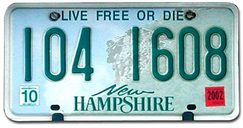
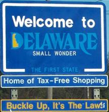
State brands or slogans should be something you’d be proud to put on your license plates. North Carolina—First in Flight. Commemorating the Wright Brothers. I think of them every time I fly coast-to-coast in five hours. New Hampshire—Live Free or Die. If you’ve ever met someone from New Hampshire you understand that one. My favorite: Delaware. Home of Tax Free Shopping. Simple. To the point. And about what you’d expect from the domicile of thousands of corporations.
Colorado's new slogan “It’s Our Nature” is clever by a half. And the press release tries too hard to sell it. And it raises the question: What about Wyoming? Montana? Alaska? They are all breathtakingly beautiful states. What makes Colorado more natural? What makes Colorado Colorado?
Having done a good deal of work with government over the years I understand that your work is often subject to collaborative review, endless iterations , and political calculus. I get that. It looks to me like this campaign had too many hands in it, all of which, unfortunately, are listed in the release.
 |
| International Symbol for Carbon Monoxide Poisoning |
If you’re in charge of putting out press releases, remember the the three rules: keep it interesting, keep it short, and, above all, before it hits the wire make sure its worthy of a mention here and there.
I hate to be contrary on this. But lobsters swim against the current. Sorry. It’s our nature.